Saturday, 12 January 2013

Technical Research HTML5


What is HTML5?


HTML5 will change the digital landscape, transforming the role of rich internet applications along with it. After ten years this is the newest form of HTML and will revolutionise the way designers create websites and also the way users interact with them.  

This new feature has integrated functions, including new video and audio commands, and a range of benefits for designers looking to bring interactivity and quality internet functions to sites without the need for heavy coding. HTML 5 focuses largely on web applications, something not catered for in previous versions.

By including new section tags such as <nav> and <article>, HTML 5 will give designers significantly more control over the final look and feel of their websites. Most designers these days are comfortable with the basics of CSS, and elements such as these will go a long way to simplifying mark up with the new tags replacing common <div> components.

HTML5 isn't so much a Flash killer as an attempt to make web pages more flexible and more like independent applications. There are two motivations: fixing some of the issues with current HTML code and simplifying standard features - so, for example, a new <nav> item explicitly defines navigation bar items, and makes them easier to design and work with. The second is extending web pages so they can include useful features that are familiar on the desktop, such as drag-and-drop and undo. Data will become more interactive, mobile and editable.

<canvas>
Defines an area for drawing, which can be filled with JavaScript commands. There are no limits on the JavaScript you use, so you have a blank canvas that you can fill with scripted drawing operations. The one catch is that drawn objects can't be referenced through the DOM (Document Object Model) used in current browsers, so the JavaScript has to be self-contained, and you can't easily control objects with external code.
<video>
Embeds video. For audio, use the <audio> tag. <video> is like an updated version of the <img> tag - it works as easily, using similar syntax. Pick a source file, and your video is ready to play. More advanced options include explicit per-browser codec support and selection, progress updates and JavaScript transport control, so it's easy to build your own custom player window.
<nav>
Defines items in a nav bar. Instead of having to hack your pages to add nav bar features, the <nav> tag tells the browser to handle nav intelligently, with optional rollover, hover and click support, and other essential effects.
<aside> and <article>
These tags offer simple semantic tagging. <aside> is content that it is related to but separate from its container, while <article> tags news feeds, blogs, forum comments or other content, which can be from an external source.
<header>
Not to be confused with the existing header formatting tags, this defines an introduction to a document. It can indicate above-the-fold summaries. When used with the new communication features, pages can easily aggregate <header> content from multiple pages to create a quick summary.


Technical Research CSS3

What is CSS3?

“CSS” is an acronym for Cascading Style Sheets, a web-based markup language used to describe the look and formatting of a website to the browser.“CSS3” simply refers to the latest incarnation of CSS, with additional capabilities far beyond the scope of the first two generations.


Because of its modular structure, CSS3 allows developers to build web pages with relatively lightweight code requirements. That means fancier visual effects, better user interfaces and most importantly, cleaner pages that load faster than ever before. Simply put, CSS3 is the presentation layer of a web page that leads the charge for all of the other technologies buried within.

CSS3 finally brings the promise of desktop-style layout to web pages, complete with graphic elements such as drop shadows, gradients, border effects, multi-column layouts and much more.


Technical Research Java Script

What is JavaScript?
JavaScript is the most popular scripting language in the world. It is the standard language of the web, and widely used in servers, desktops, and mobile phones.


A scripting language is a lightweight programming language that supports the writing of scripts. JavaScript was designed to add interactivity to HTML pages. JavaScript is programming code that can be inserted into HTML pages to be executed by web browser. Many HTML designers are not programmers, but JavaScript is a language with a very simple syntax. Almost anyone can put small "snippets" of JavaScript code into HTML pages.

HTML and JavaScript are two completely different things. HTML is a markup language designed for defining static web page content. JavaScript is a programming language designed for performing dynamic tasks. Sometimes the distinction is confusing because JavaScript code can go in the same file as HTML. JavaScript support is built right into all the major web browsers, including Internet Explorer, Firefox and Safari.

Visual Research Information Graphics

Graphical Representations and Visual Content

Information design in its widest sense is about the selection, organisation and presentation of information to a given audience. The information itself can come from almost any source such as a weather map or timetable listing travel departures. Unlike much of advertising and marketing design, in which the object is to persuade the user into a course of action, information design tries to present all of the objective data required to enable the user to make some kind of decision. 

The information is usually only of value to us if it includes material that we are not already aware of. The designer is given a set of information- wether of raw data, a set of actions or a process, and must turn them into a visual process capable of revealing its essence in terms which a particular audience can grasp easily. 

Most information graphics falls into three categories. The first involves information presented as an organised arrangement of facts or data, such as a timetable or map, from which users are free to extract only that information which they need for a given purpose. The second involves information presented as means of understanding a situation or process, such as a guide book or stage by stage description on how to get a machine to operate. The third involves design of control systems.

Typography


Type for Print and Screen


Pictorial type has made a massive impact on the creative industry in the last few years. Some designers try to blur the line between illustration and typography, and enjoy the unexpected images that can be produced. Designers can sometimes seek out recognisable shapes within letters and create an image fro them. Type for print in magazines for example can sometimes be quite different to type on screen. It is often a lot less elegant and more funky and eye-catching in order to advertise a brand or sell a product. Like the example below it can sometimes be three dimensional and  form the outline or content of an image in correspondence with the text.  This particular design is interesting because it has different colours sizes and textures added to the text to make it represent and image and also has the added boost of a shadow for effect. 


Large amounts of text for screen can be displayed in visually aesthetic ways by combining colours and highlights to and also behind the body to text to make is stand out whilst still remaining legible. 


Graphical Illustrations


Illustrations for Magazines or Articles


Here are some examples of Grundini's illustrations showing the basic communication of design. There are many bright and interesting illustrations which are strong and communicate a good sense of creativity to engage the onlooker, especially the illustrations for magazines such as creative review. His work can be both mature with a playful aspect but also a young and childlike feel which still engages all audiences. Some pieces are very detailed and intricate where as others are very simple and clean. 


Some of the pieces below are strong in typography and colour whereas others are stronger in imagery with illustrations and layers. These pieces represent good aspects of webpages which might be beneficial to when it comes to design the layout and features of my own work. Some pieces combine the use of large scaled and eye catching imagery in relation to smaller more compact text. 


Mind Maps


Thought Processes


Here I have used mind maps as a way to break down the content of the website and think of the best way to include all the necessary elements. I have thought up ideas for the webpage regarding the animations, themes, illustrations, names, layout and colour scheme. 


Here I have taken inspiration from magazines showing illustrations for both print and screen and examples of web layouts which could be beneficial to me. I have taken a particular interest in illustrations which have a sketchy style and a circular theme. 


I began looking at names and logos for the journal. I have tried to make them quite quirky and unique as well as having a humour aspect.


Here I have done some sketches of what could be included as part of the content of the pages of the website. I particularly like the idea of having paper clips and post it notes as part of the page to deliver the information.


I have created some thumbnail sketches to get a rough idea of what the page could look like. I am drawn to the circular themed ideas such as bubbles, balloons and cogs which could be created with an illustrated style to fit in with my desired theme.


Simple Trials


Experimenting 

Here are some example pieces that I have created when getting a feel for making elements move across a page as well as gaining a deeper understanding.

Seventies Illustration


Inspiration

Here I have looked at existing examples of websites which have creative and interesting illustrations within them. I would like to use this in my own work, sketchy illustrations and bright colours for a creative style.  Some of these websites have unique layouts and are pleasing to look at. I have also looked at some circular themed illustrations as I think this would be a good theme to go ahead with.


Starting The Website

Header


Initially the plan to have a design diary from the point of view of a geek/dweeb encountered some problems and I found that the thumbnail sketches containing circles and cogs/balloons would be more effective as part of the theme alongside seventies illustration. Therefore I kept the idea of making a diary but made it much more elegant thus creating the name a dainty design diary with girls explaining how to make and create a professional yet creative web page.


I started by designing the header as it is situated at the top of the webpage and is going to the the main form of navigation. Various colours are used throughout the header using elaborate and wild brush strokes to create a vivid and lively feel. The text also corresponds to the lively theme with a hand written style of text appearing in rough brush strokes as well. The size of the text on the header changed slightly from it being quite small to becoming large and much easier to see.


After creating the header I designed a character for each page which would be displayed within the header area. There are six characters to correspond to each section (Home, Layout, Colour, Typography, Animation and Interaction). 


Each character was then added to a circle and each had an individual colour. Initially the characters were placed within the circles but as I developed the circles and the header area they became situated on the outside line of the circles and the outline of each circle became lighter almost like a floating bubble. 


I also created some other characters to be place on the far right hand side of the page underneath the logo and header. These also have a sketchy style and colour correspond to each page. 


My idea for each page was to have the corresponding character talk about their topic e.g. typography. So I designed the character alongside a speech bubble on each page with a hover element added so that the user could interact with the character and speech bubble by floating over it with the mouse upon which the characters' bubble would then fill with text and tell them all about their topic and inform them on how to create a great website with the most important hints and tips.   


This is the home page that I have created. Each of the circles sits at the top in the header area with the characters and each has a link to the other pages. All of the circles and header elements slide down when the page is opened or refreshed with the use of jQuery. The background has been designed to be bright and colourful with a white circle to the right of the centre to act as the main source of each interaction. All of the smaller surrounding circles also slide down and are interactive with a hover so that they rotate or change colour. 


This is the second page of the website . The page is identified as being selected by the bolder outline around the circle within the header. Also this is where each individual page character come into play with the character being on a larger scale beneath the header alongside a speed bubble containing information about the particular topic. The animation for this page has pointing fingers containing words displaying key points of web layout. These move from side to side with the use of jQuery.


This page has an animation displaying a colour wheel which is appropriate to the topic of the individual page. Like with some of the other pages the colour swatches move up and down and from side to side with the use of jQuery.


The typography page has many different circles all displaying various letters with different fonts. This is to show which fonts work well on a webpage and which are less effective than the others. When the page is refreshed each circle slides down from the top of the page at different times which creates an unusual and creative effect. 


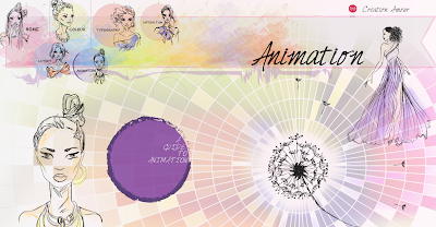
The animation page shows and animation of a dandelion with the seeds moving in and out with jQuery as though they are blowing in the wind. This is quite a simple animation but I think it fits nicely with the rest of the page but is simple but effective. 


This is the page which shows interaction so I have used balloons to fit in with the circular theme and each balloon moves when the mouse hovers over it. This is quite a simple interaction as I did not want to overcrowd the page.


These images show how the rest of the information is displayed on each page in elegant tags which are colour corresponded to each individual page. This also applies to the footer of each page. 

This concludes the content of the website. Lots of animations and use of jQuery have been used in the website to make it more interesting when the page is opened or refreshed especially the slide down effect.