Initially the plan to have a design diary from the point of view of a geek/dweeb encountered some problems and I found that the thumbnail sketches containing circles and cogs/balloons would be more effective as part of the theme alongside seventies illustration. Therefore I kept the idea of making a diary but made it much more elegant thus creating the name a dainty design diary with girls explaining how to make and create a professional yet creative web page.
I started by designing the header as it is situated at the top of the webpage and is going to the the main form of navigation. Various colours are used throughout the header using elaborate and wild brush strokes to create a vivid and lively feel. The text also corresponds to the lively theme with a hand written style of text appearing in rough brush strokes as well. The size of the text on the header changed slightly from it being quite small to becoming large and much easier to see.
After creating the header I designed a character for each page which would be displayed within the header area. There are six characters to correspond to each section (Home, Layout, Colour, Typography, Animation and Interaction).
Each character was then added to a circle and each had an individual colour. Initially the characters were placed within the circles but as I developed the circles and the header area they became situated on the outside line of the circles and the outline of each circle became lighter almost like a floating bubble.
I also created some other characters to be place on the far right hand side of the page underneath the logo and header. These also have a sketchy style and colour correspond to each page.
My idea for each page was to have the corresponding character talk about their topic e.g. typography. So I designed the character alongside a speech bubble on each page with a hover element added so that the user could interact with the character and speech bubble by floating over it with the mouse upon which the characters' bubble would then fill with text and tell them all about their topic and inform them on how to create a great website with the most important hints and tips.
This is the home page that I have created. Each of the circles sits at the top in the header area with the characters and each has a link to the other pages. All of the circles and header elements slide down when the page is opened or refreshed with the use of jQuery. The background has been designed to be bright and colourful with a white circle to the right of the centre to act as the main source of each interaction. All of the smaller surrounding circles also slide down and are interactive with a hover so that they rotate or change colour.
This is the second page of the website . The page is identified as being selected by the bolder outline around the circle within the header. Also this is where each individual page character come into play with the character being on a larger scale beneath the header alongside a speed bubble containing information about the particular topic. The animation for this page has pointing fingers containing words displaying key points of web layout. These move from side to side with the use of jQuery.
This page has an animation displaying a colour wheel which is appropriate to the topic of the individual page. Like with some of the other pages the colour swatches move up and down and from side to side with the use of jQuery.
The typography page has many different circles all displaying various letters with different fonts. This is to show which fonts work well on a webpage and which are less effective than the others. When the page is refreshed each circle slides down from the top of the page at different times which creates an unusual and creative effect.
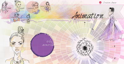
The animation page shows and animation of a dandelion with the seeds moving in and out with jQuery as though they are blowing in the wind. This is quite a simple animation but I think it fits nicely with the rest of the page but is simple but effective.
This is the page which shows interaction so I have used balloons to fit in with the circular theme and each balloon moves when the mouse hovers over it. This is quite a simple interaction as I did not want to overcrowd the page.
These images show how the rest of the information is displayed on each page in elegant tags which are colour corresponded to each individual page. This also applies to the footer of each page.
This concludes the content of the website. Lots of animations and use of jQuery have been used in the website to make it more interesting when the page is opened or refreshed especially the slide down effect.


This comment has been removed by the author.
ReplyDeleteinteresting blog Kelly :)
ReplyDeleteThanks :)
Delete